OneNote rebrand
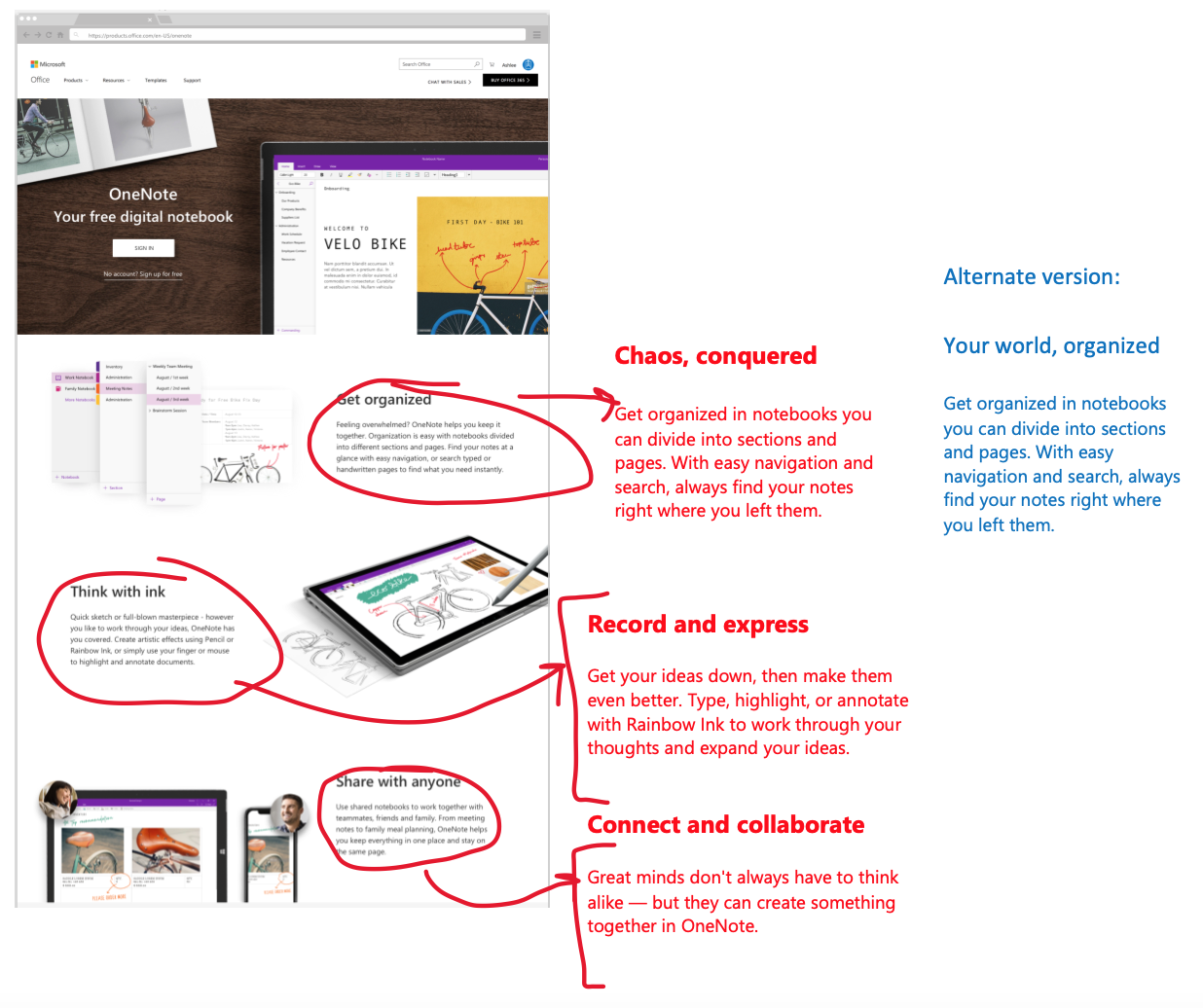
I was brought onto the OneNote design team as a rebranding writer. Working in lockstep with visual designers, motion designers, illustrators, and a creative director, I overhauled several elements of the OneNote marketing and in-product experience:
First-run experience in product
Marketing site
App store copy
The challenge? Reframing the value prop of OneNote in a way that conveyed both universality and applicability to every unique creator’s purpose. The OneNote team knew from research that perception of the product was enterprise, office worker, corporate. What the design team and I did was reframe the copy and design in these interfaces (FRE, main product page, and app store) to tell every kind of worker, creator, and note-taker that how they wanted to organize was up to them—after all, it’s their world. OneNote’s the infinite (and infinitely organize-able) canvas supporting it.


